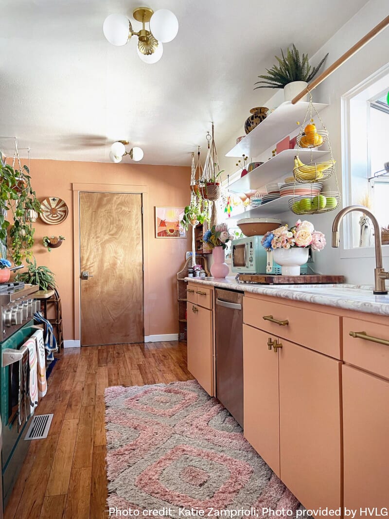
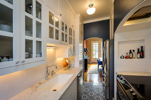
Not everyone has a large, expansive kitchen! Many people live in homes with much smaller galley kitchens. But just because your kitchen is slimmer and more diminutive doesn’t mean it can’t be lit well. Let’s check out some galley kitchen lighting looks and break down what makes them work. I’ll also provide some fixtures you can use to get the look–click on each picture to see the suggested items!
Schoolhouse rocks
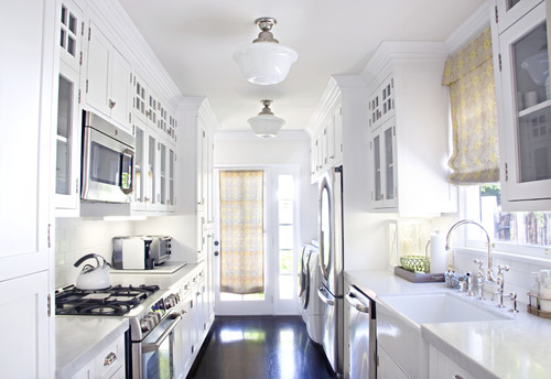
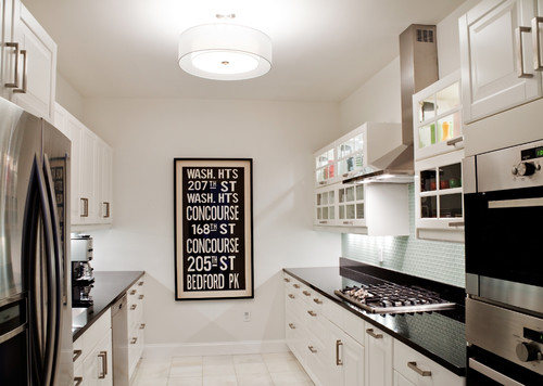
Natural light is obviously a great help in brightening up a galley, as is a white color scheme. This kitchen in LA looks lovely and airy in great part because of these things. But those stylish semi-flush schoolhouse lights surely help, especially when it’s dark! Get this look with the Sea Gull Academy.
Here’s another take on a schoolhouse-esque light. I like how this one reads as Art Deco, which goes with a lot of the other design elements in here. Those soapstone countertops are really nice. Get this look with the Hudson Valley Dutchess.
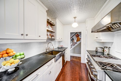
This schoolhouse-style light hangs down–if you’re planning on using a pendant, definitely do some measuring first. See if the pendant will hang down too far and become a head-thwacking hazard, whether for tall people or short people who are on a stepladder trying to get things out of high cabinets. That being said, that tin tile ceiling is awesome. Get this look with the Millennium Lighting Neo-Industrial.
What makes schoolhouse lights great, aside from the sleek and minimal look, is that they usually have opal glass shades. That way, they provide lots of light but without any bare bulb glare. Get this look with the Trade Winds Dorothy.
Glamorous
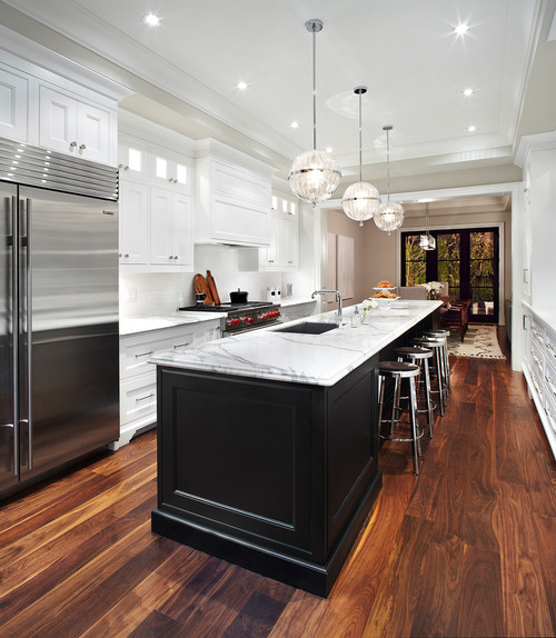
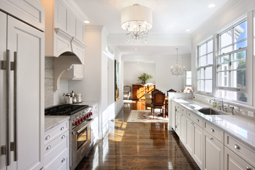
Granted, this is a larger galley–it has room for an island in the middle, after all–but the ribbed pendants add a lovely touch. Get the look with the Trade Winds Victorian.
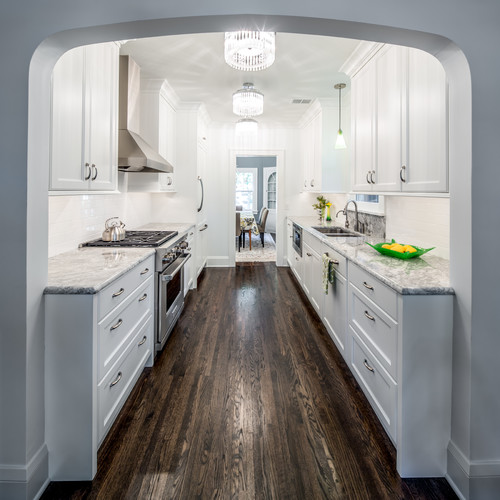
A trio of semi-flush mounts fringed in crystal create total glam. I also spy a pendant over the sink! Good touch. Get the look with the Crystorama Mercer.
On track
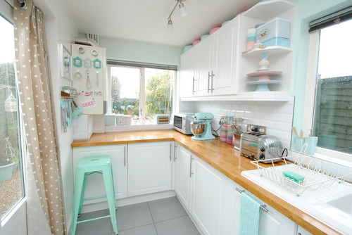
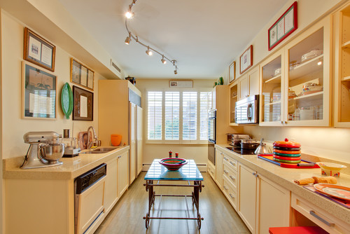
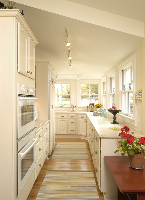
This adorable little cream puff of a kitchen looks like a baker’s paradise and gets light from a track lighting fixture. Tracks are great because you can adjust each head independently! Get the look with the Quoizel Theater.
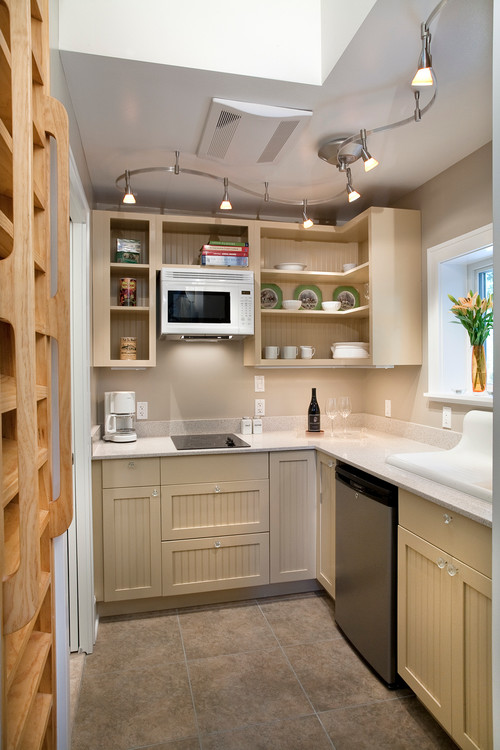
The track light fixture here curves all around the room like a snake, giving light all over the place! Get the look with the George Kovacs GK Lightrail.
Here’s another snakelike track light. Get the look with the Quoizel Centerstage.
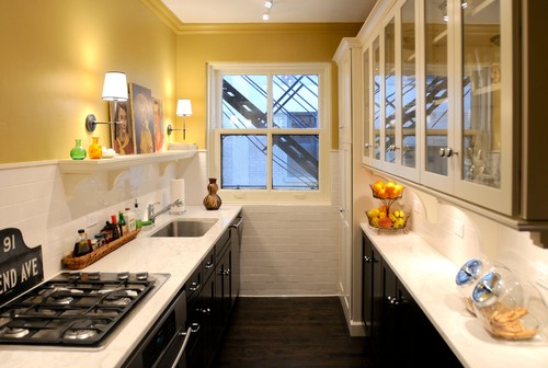
The track in this kitchen is kind of hard to see–try looking at the reflection in the glass-fronted cabinets at right–but does illustrate how light can be subtle yet powerful. The sconces are a great touch, too! Get the look with the Kichler Hendrik.
Looks like this kitchen has two different tracks of light, one for each zone of the room. Smart idea, especially if you can turn them on and off separately. Get the look with the Access Optix.
Note that we also have track lighting options that don’t really look like the typical track light. We have ones that look like small Tiffany lamps, industrial pendants and much more!
Pretty pendants
This light skillfully blends chandelier beauty with drum pendant diffusion. Get the look with the Crystorama Middleton.
I like how this drum shade light has a second outer shade that appears to float in midair. Get the look with the Kichler Lacey.
Here is another drum shade pendant that looks great–but also check out the light at the toe kicks of the cabinets! That looks like LED tape light, which is so slim and sleek that it’s perfect for galley kitchens. Get the look with the Sonneman Puri.
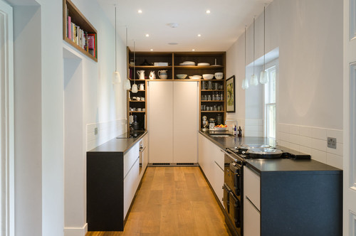
These pretty pendants have an airy look that doesn’t take up a lot of visual space…which is good, since it’s clear there isn’t much space at all in here, so you can’t waste any of it! Get the look with the Sea Gull Driscoll.
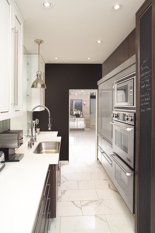
This kitchen may be small, but it means business–just look at all the appliances on the right side–and the industrial pendant over the sink reinforces that ideal. Get the look with the Hudson Valley Pelham.
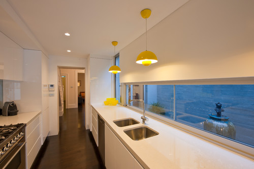
Sometimes, white kitchens run the risk of looking too cold and sterile. One way to make sure that doesn’t happen is to add some color! Get the look with the Varaluz Urchin.
See! No matter how small your kitchen is, you can give it stylish lighting to make it shine. If you need help with galley kitchen lighting, feel free to find us on social media or call 1-866-688-3562.
Photos from Houzz. Photo credits in alt tags.

